L'Abbé Plot
Menu locations: Analysis_Meta-Analysis_Odds Ratio, Analysis_Meta-Analysis_Relative Risk.
This plots the event rate in the experimental (intervention) group against the event rate in the control group, as an aid to exploring the heterogeneity of effect estimates within a meta-analysis (Song, 1999; L'Abbé et al. 1987).
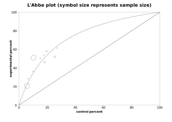
StatsDirect draws the plot with the odds ratio, Peto odds ratio and relative risk meta-analysis reports, before the forest plots. Each study is a circle at its event rate in the control group (across) and its event rate in the experimental group (up), both as percentages of the group, with the radius of the circle in proportion to the number of subjects in the study. The solid diagonal is the line of equal rates: a study below it had the lower event rate in its experimental group. The dashed line shows where the studies would lie if all shared the pooled fixed effects estimate (Mantel-Haenszel, or Peto): for a relative risk it is the straight line from the origin with that slope; for an odds ratio it is the curve of that odds ratio, which meets the diagonal at both ends. Studies far from the dashed line, or scattered on both sides of the diagonal, are a sign of heterogeneity, which the meta-analysis report also tests.
Illustration
Test workbook (Meta-analysis worksheet: Exposed total, Exposed cases, Non-exposed total, Non-exposed cases, Study).
The plot above is from the odds ratio meta-analysis example (Armitage and Berry, 1994: smoking among lung cancer patients and controls in ten studies). The illustration below uses the seven placebo-controlled trials of aspirin after myocardial infarction from the relative risk meta-analysis example (Fleiss and Gross, 1991).
To draw it in StatsDirect open the test workbook using the file open function of the file menu. Then select Relative Risk from the Meta-analysis section of the Analysis menu. Select the columns marked "Exposed total", "Exposed cases", "Non-exposed total" and "Non-exposed cases" when prompted for data, and the column marked "Study" for the stratum labels. The plot follows the report.
For this illustration:
L'Abbe plot (symbol size represents sample size)
| Study | control percent | experimental percent | Study size |
| MRC-1 | 10.737179 | 7.96748 | 1239 |
| CDP | 8.300908 | 5.804749 | 1529 |
| MRC-2 | 14.823529 | 12.259615 | 1682 |
| GASP | 12.297735 | 10.094637 | 626 |
| PARIS | 12.807882 | 10.493827 | 1216 |
| AMIS | 9.703146 | 10.851345 | 4524 |
| ISIS-2 | 20 | 18.283452 | 17187 |
Pooled relative risk = 0.913608 (95% CI = 0.8657 to 0.964168)
The report does not print these rates: they are the coordinates of the seven circles, and the pooled relative risk of the fixed effects analysis is the slope of the dashed line. All seven trials lie close to the diagonal and a little below it, as a relative risk of 0.91 implies, with AMIS the only trial above it and none standing apart from the rest, so the plot gives no sign of gross heterogeneity, in keeping with the I² of 39.6% in the meta-analysis report.

 R code
This R code reproduces the illustration above. It needs no packages and was checked with R 4.6.1. Paste it into R, or save it as a script and run it.
# L'Abbe plot: the StatsDirect help illustration (Fleiss and Gross 1991, deaths after
# myocardial infarction in seven placebo-controlled trials of aspirin; the test
# workbook's Meta-analysis worksheet columns A to E) in R
study <- c("MRC-1", "CDP", "MRC-2", "GASP", "PARIS", "AMIS", "ISIS-2")
exposed_total <- c(615, 758, 832, 317, 810, 2267, 8587)
exposed_cases <- c(49, 44, 102, 32, 85, 246, 1570)
control_total <- c(624, 771, 850, 309, 406, 2257, 8600)
control_cases <- c(67, 64, 126, 38, 52, 219, 1720)
k <- length(study)
six <- function(x) formatC(x, digits = 6, format = "f", drop0trailing = TRUE)

# The plot has no function in base R: it is a scatter plot of each study's event
# rate in the experimental (exposed, treated) group against its event rate in the
# control group, both as percentages, with the study size setting the symbol size
experimental <- 100 * exposed_cases / exposed_total
control <- 100 * control_cases / control_total
n <- exposed_total + control_total
cat("Study  Control percent  Experimental percent  Study size\n")
for (i in 1:k) {
  cat(paste(study[i], six(control[i]), six(experimental[i]), n[i]), "\n", sep = "")
}

# The dashed line of the plot has the slope of the pooled relative risk of the
# fixed effects analysis (Mantel-Haenszel, Rothman-Boice), as the relative risk
# meta-analysis reports it, with the Greenland-Robins variance of its log for the
# confidence interval
a <- exposed_cases
b <- control_cases
cx <- exposed_total - exposed_cases
d <- control_total - control_cases
rr_mh <- sum(a * (b + d) / n) / sum(b * (a + cx) / n)
v_mh <- sum(((a + b) * (a + cx) * (b + d) - a * b * n) / n^2) /
  (sum(a * (b + d) / n) * sum(b * (a + cx) / n))
ci <- exp(log(rr_mh) + c(-1, 1) * qnorm(0.975) * sqrt(v_mh))
cat("Pooled relative risk = ", six(rr_mh), " (95% CI = ", six(ci[1]), " to ",
    six(ci[2]), ")\n", sep = "")

# The plot as StatsDirect draws it: both axes from 0 to 100 percent, a circle for
# each study with its radius in proportion to the study size (the smallest studies
# get a minimum size, and when the largest study is more than five times the mean
# every symbol is shrunk so that the largest has the radius of a study five times
# the mean), the solid line of equal rates and the dashed line of the pooled
# relative risk, which is cut off where it leaves the square
scale <- mean(n) * max(1, max(n) / mean(n) / 5)
radius <- pmax(3, round(6 * n / scale))
plot(control, experimental, xlim = c(0, 100), ylim = c(0, 100), cex = radius / 6,
     xlab = "control percent", ylab = "experimental percent",
     main = "L'Abbe plot (symbol size represents sample size)")
abline(0, 1)
abline(0, rr_mh, lty = 2)

# The inconsistency statistic of the meta-analysis report: Cochran's Q about the
# pooled log relative risk, each study weighted by the inverse of the variance of
# its log relative risk, and I2 = (Q - df) / Q as a percentage, no less than zero
w <- 1 / (1 / a - 1 / (a + cx) + 1 / b - 1 / (b + d))
q <- sum(w * (log(a / (a + cx) / (b / (b + d))) - log(rr_mh))^2)
i2 <- max(0, 100 * (q - (k - 1)) / q)
cat("I2 (inconsistency) = ", formatC(i2, digits = 1, format = "f"), "%\n", sep = "")

# The studies lie close to the line of equality and a little below it, as a
# relative risk of 0.91 implies, and none stands out from the rest: the plot
# suggests no gross heterogeneity, in keeping with an I2 of 39.6%
See also: meta-analysis and Forest plot.