Bar Plot
Menu location: Graphics_Bar or Column.
A bar plot gives a simple comparison of counts or summaries of measurements reflected as the relative lengths of a group of "bars", drawn either vertically or horizontally.
Where a group of measures are considered, for example blood pressure and cholesterol, in five ethnic groups of patients, then the primary measurement bars can be moved together in the groups.
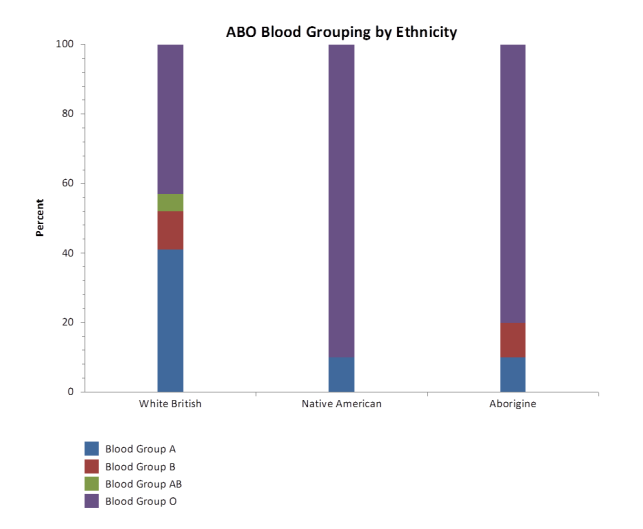
You can choose to show groupings side by side or as a stack of bars on top of one another. The stack can also be made "100%" where you want to show the relative percentage make up of subgroups in a group, which is equivalent to a pie chart. In the example below the ABO blood group distribution is shown for three ethnic groups using this function:-
